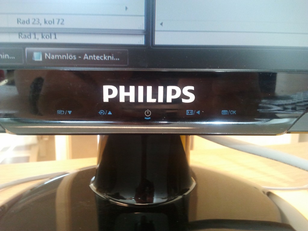
 Here’s an example of how the Philips-designers have totally failed, they used touch-controls for the menu system. Touch-controls are nice, but only on a screen-surface.
I’ve to push extremely hard to navigate through the system, it feels like I’m breaking the screen.
- A menu-system should be easy to navigate through
- Have a nice tactile feed-back that matches each menu-step
- Easy accessible buttons
- The placement of the buttons should match the lineup of the GUI-menu
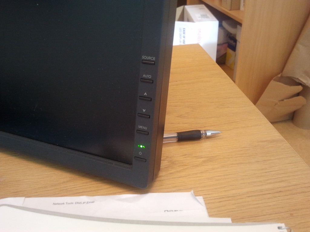
Here’s a good example of a IBM monitor, they use clearly visible buttons that lines up vertically with the menu.

Many designers lay to much energy into appearance and less into accessibility. Accessibility is such a vital part of our life.
… also, computer-monitors shouldn’t have integrated speakers. That trashy speakers produce some really bad sound-quality and take too much room in the monitor. I’ve never seen someone actually used integrated monitor-speakers.
If the appearance starts to effect the functionality and accessibility of a product it’s wrong.
