@Grab and Drag: WTF happened? (Firefox) [Updated 2012-05-01]

Grab and Drag (https://addons.mozilla.org/en-US/firefox/addon/grab-and-drag/) is a great plugin to Firefox which enables you to scroll long pages by holding down your mousebutton. It works just like Adobe Reader, a small grabbing hand cursor appears when you drag the page.
Another cool feature is “Drag Multiplier”, when you drag like a 100 pixels it actually scrolls the page 300 pixels, if you have the Drag-Multiplier-setting of 3.

If you enable “Momentum” you can throw the page in one direction and it will keep scrolling that way until it reaches the end of the page.

All these features really simplifies web-browsing, not only on tablet-PC’s but on ordinary PC’s as well!

The latest version of Grab and Drag arrived and they seemed to removed the Grabbing-option. I use to have the Grabbing-option on “Non-text, non-link” which means I could still click on text and select text and if I wanted to scroll I could just grab a empty screen-area.
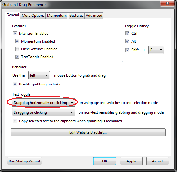
[Updated 2012-05-01] I emailed Ian about this and he told me to check out the new feature TextToggle: “Dragging horizontally or clicking”, it’s designed to replace the old “Non-text, non-link”-option.
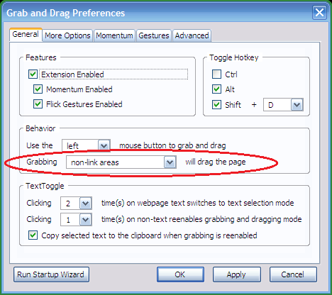
Old settings

New settings

Now I’ve to toggle Grab And Drag to be able to select text which is really annoying. It interrupts the flow of the web-browsing.

I usually selects parts of a long text to note how far in the reading I’ve come, to easily resume my reading whenever I want to.
Designers shouldn’t get the last word: Philips Touch-fail

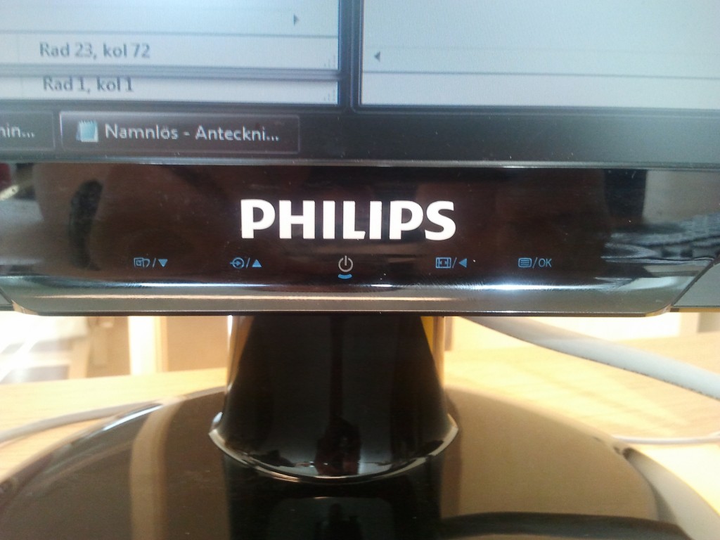
Philips 243E2 Monitor - Touch Buttons Here’s an example of how the Philips-designers have totally failed, they used touch-controls for the menu system. Touch-controls are nice, but only on a screen-surface.
I’ve to push extremely hard to navigate through the system, it feels like I’m breaking the screen.

  • A menu-system should be easy to navigate through
  • Have a nice tactile feed-back that matches each menu-step
  • Easy accessible buttons
  • The placement of the buttons should match the lineup of the GUI-menu

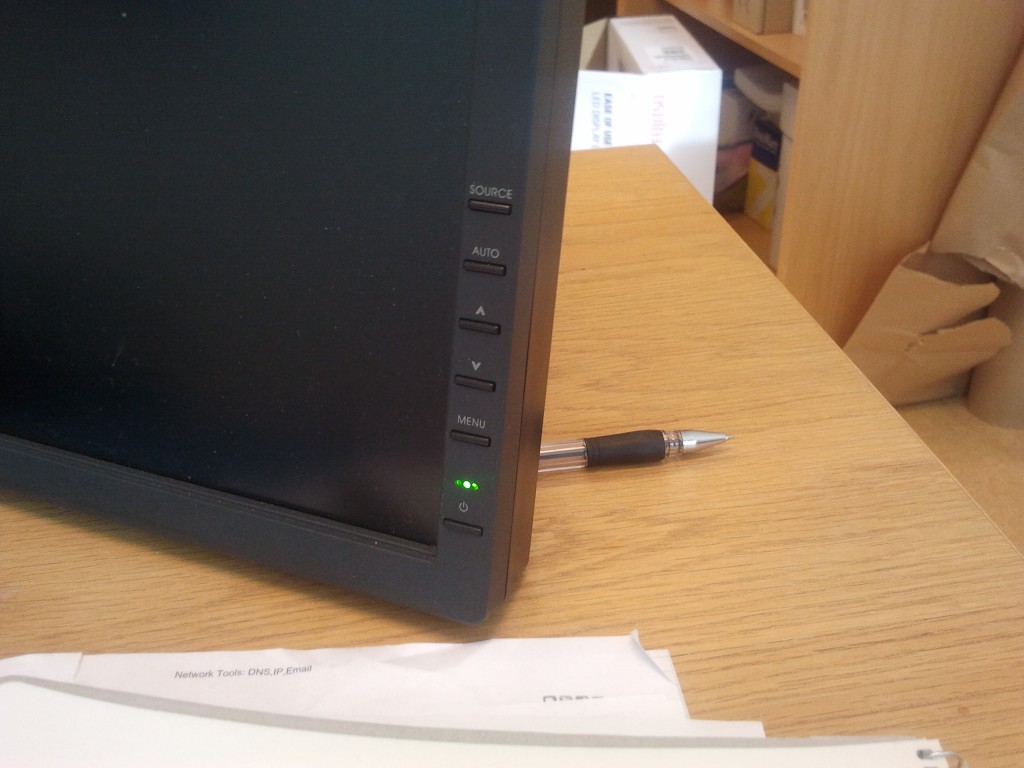
Here’s a good example of a IBM monitor, they use clearly visible buttons that lines up vertically with the menu.
IBM Monitor Buttons

Many designers lay to much energy into appearance and less into accessibility. Accessibility is such a vital part of our life.

… also, computer-monitors shouldn’t have integrated speakers. That trashy speakers produce some really bad sound-quality and take too much room in the monitor. I’ve never seen someone actually used integrated monitor-speakers.

If the appearance starts to effect the functionality and accessibility of a product it’s wrong.

Ikea-hack Lerberg receiver stand


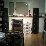
I’d this idea of a new receiver stand in my head, paralleled legs in a slight angle with different shelves.
So I browsed a little on Ikea and find the Lerberg-shelf (http://www.ikea.com/se/sv/catalog/products/70114753/), it was almost exactly the way I imagined it in my head. I thought if I could bend the back legs it would be nice and my maybe shorten the legs.
It’s much easier to modify an existing product than creating a totally new one, so I decided to buy it.


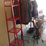
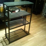
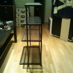
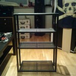
Here are two examples of how the shelves looks like non-modified.


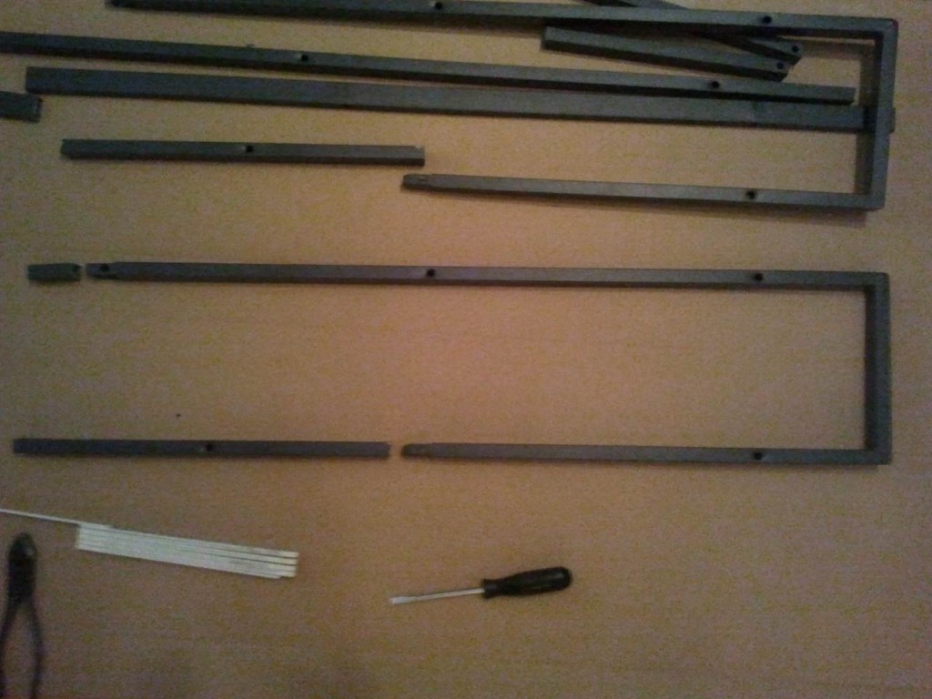
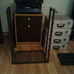
I cut out the legs to make it shorter and bent the back legs.


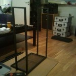
I attached the bottom shelf to get a feeling how it would be.


Screwed the rest of the shelves on.


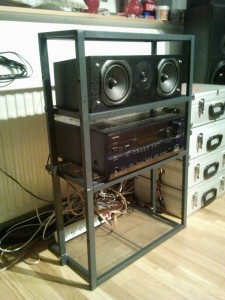
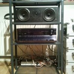
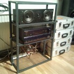
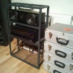
This is the finished result.
It turned out pretty good. It is more stable than anticipated and could maybe even hold a 42″ flatscreen.

Swedbank ATM failed today


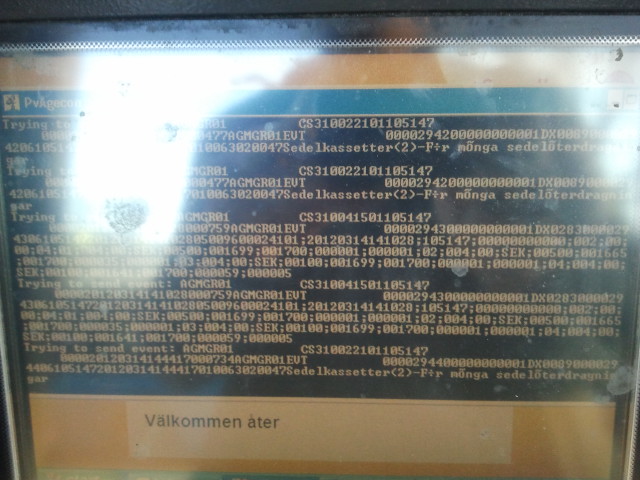
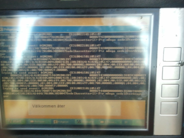
When I was going about to get some cash earlier today, this sight met me at the Swedbank ATM at Brunnsparken.

I had to document this. This looks like quite sensitive information leaking out.

Trying to send event: AGMGR01    CS310041501105147

SEK;00100;001699;

För många sedelåterdragmnigar


You could see that the ATM is running Windows XP in the background. 🙂

Quite bad pictures, but I had the sun behind my back.